This is a story of working better together, becoming more efficient and producing best-in-class, high quality products as a result. I’m not talking about designers (both UX and Creative) becoming expert programmers, just about how general and high-level knowledge is often more than enough to make huge differences not only in the product itself, but also on how efficient we work out as a team.
My challenge to my creative friends and peers – go beyond the design, look at this from a “problem-solving” point of view rather than from just the creative and arts one. What problem? Well, it’s more of a challenge. The web is a complicated world, and with the ever evolving web architectures, platforms, user expectations on speed, usability, accessibility and context-awareness, it’s not an easy task to come up with simple yet effective designs that solve our client’s needs.
Sure, you might argue that that’s the whole purpose of us as tech leads and experts, pointing out what’s possible and what’s not. In my experience, that’s half-true, in the sense that teams that work in highly collaborative ways create the best products. Those are teams where creatives know about the technical challenges, and technology knows and are part of feature definition, UX & strategy phases, etc.
Two main points I’d like to suggest paying special attention:
- Basic knowledge of key web drivers
- Team structure and how disciplines collaborate might have a direct impact on the underlying technology (this is the WHY?)
Key Web Drivers
- Critical-rendering path and above-the-fold content prioritization
- Fonts and their effect on performance
- Mobile first design, progressive enhancements and graceful degradation
- Fluid layouts vs. pixel-perfection
- Information design, architecture and impact on SEO
- Technical and perceived user performance, RAILS
- Web optimization of assets
- Modularity and reusability of components
Critical-rendering path and above-the-fold content prioritization
There is science behind delivering a fast web-experience to users, and it requires a lot of work by the browser. Most of it is hidden from end-users, and most likely it appears to be ‘magic’. From an engineering and web development perspective though, there is tons of architecture and design thinking that happens behind the curtain, or at least it should be happening.
But this is not a post for devs or the dev techniques to optimize the load, this is to highlight what UX/Creative should be aware of. So, an image speaks a thousand words. The optimized rendering is what we should be aiming for.

What about UX/Design?
- Be mindful of your page layouts. Simple layouts are easier to optimize.
- Don’t make the page larger that it needs to be. It all comes down to bytes being transferred.
- Web-optimize the assets being delivered (more on this later).
- Think about the content that lives above the fold, or what needs to be rendered FIRST. Do you really need that video on the hero? Do you need it playing as soon as the user hits the page? Can the experience allow for such elements to be deferred until the user interacts with it?
- Think about a lazy-loading experience, only loading content when/if needed.
Fonts and their effect on performance
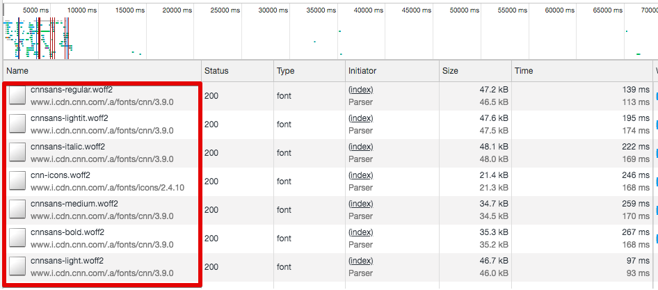
You might think that you are using just 4 fonts across the site, but when it’s time to render the page, it usually means loading many additional font files – different font formats (ttf, otf, svg, eot, woff, woff2), families, weights, etc. I have led projects where we need to bring the number of fonts request from 35! (you read that right) to just 6 font requests.
Did it hurt the look & feel of the site? Did the creative vision was compromised? Did it hurt feelings? The answer to all of those questions is NO. If you ask me, the site ended up looking better, more sleek and with more a cohesive design language. But, was it worth the “trouble”? We improved page load by almost 2 seconds, that in web speed world, is an era.
As an example, below is what CNN.com loads just on its homepage.
Devs can do some tricks such as caching and fonts pre-loading, but it all starts with design.
What about UX/Design?
- Take the challenge and ask yourselves if you really need that many different fonts and weights?
- Can you simplify your design system and design guidelines to use a simpler font hierarchy?
- Involve your web leads in the discussion, ask them what options, or what alternatives you might have to help mitigate any issues with performance
Mobile first design, progressive enhancements and graceful degradation
Know the difference, and know when to use each one of them. My personal preference is to avoid graceful degradation as much as possible, but I know that in some cases it might be unavoidable, as when you inherit an old site and need to build on top of it, or when the target audience, for some reason, is still using very old browsers and devices.
Most likely, you won’t have to deal with such scenarios, the world is a different place from when such a tactic was necessary.
Mobile first – this is one of those terms that everyone uses without really knowing what it means or the implications of it. I’ve seen designs for mobile, which the team called as ‘mobile-first’, only to receive a desktop design that had nothing to do or that is technically incompatible with the mobile version. When you create ‘mobile-first’ designs, it’s all about the mindset, the content strategy and looking for simple, yet functional layouts.
What about UX/Design?
- Don’t strive for, or expect pixel-perfect executions. That doesn’t exist in the real world.
- Simplify, simplify, simplify.
- Think in terms of fluid layouts and components living in different places depending on how much space there is (i.e., viewport size).
- What about responsive assets? Are they the same, just resized depending on the screen real state? or is it a completely different asset?
- And again, I keep coming back to it, make sure your web leads are involved and are active participants in your ux & design sprints, ask them for feedback and ideas.
Fluid layouts vs. pixel-perfection
Oops, I just realized I covered it on the previous point :).
Information design, architecture and impact on SEO
Great site architecture is all about improving how users and search engines find their way around the website. Understanding your users, and giving them the most relevant information for their needs with the least amount of clicks is your goal. For search engines, a well thought site architecture helps web crawlers find and index all of the pages on the site.
It also reduces bounce rate, as users are able to quickly find what they are looking for.
What about UX/Design?
- Look for “flatter” website structures.
- Try not to obscure content behind fancy interactive experiences (i.e., asynchronous javascript, or dynamic components). It might look fancy, but just like parallax… avoid it if possible.
- Make sure there is no duplicate content.
- Offer information in context.
- Think in terms of heading hierarchies: H1, H2, H3, etc.
There is tons more that you can think of, this is just a glimpse of what you should be focusing on.
Technical and perceived user performance, RAIL
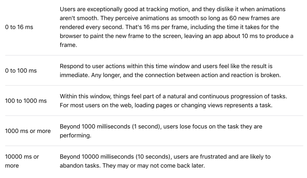
RAIL stand for: Response, Animation, Idle, Load.
I’m stealing this from Google – RAIL is a user-centric performance model that provides a structure for thinking about performance. The model breaks down the user’s experience into key actions (for example, tap, scroll, load) and helps you define performance goals for each of them.
Couldn’t have explained it better. It’s all about human perception of responsiveness to different events. For instance, as you can see below, when a user clicks on a button, it expects a response before 100ms, otherwise, the user will feel there is a delay.
What about UX/Design?
- It doesn’t hurt to understand the human psychology, and it’s also important for the entire team what are our performance goals on each one of the different event types.
- More information in References below.
Web optimization of assets
It’s all about improving the load speed, and therefore, the user’s performance perception. So we are mainly talking about 3 things:
- Deliver web-optimized assets to the dev team
- Think about progressive images
- Improve your production pipeline
The below image shows how much you can improve the image sizes by using a modern web format like WebP. It’s clear that it even outperforms tools like OptiPNG and PNGCrush.

What about UX/Design?
- There is more than PNG and JPG formats. There’s WebP, JPEG 2000, JPEG XR, etc.
- Think about image sprites when it makes sense – it reduces multiple image requests into a single file request.
- If you haven’t, open your mind to lossy compression algorithms and tools (e.g., TinyPNG). Not all sites need to be composed of 5mb images. Bring those image sizes down. Don’t overestimate human perception, there are lots of lossy compressions that human will have a hard time differentiating from the original.
- Make sure you export your images correctly: compression, progressive images, etc.
- You might have to modify your current production pipeline to make room for such ideas.
- Automate, automate, automate.
- Discuss with your dev team if there are other options. For instance, if you are using a CDN like Akamai, you can check if you can use Akamai’s Image Optimization tool to automatically deliver web-optimized, and modern web formats to the browser.
Modularity and reusability of components
This is another example of challenging yourselves in solving a “problem”, and not just making pretty sites. The challenge is coming up with a ux and design system, with a set of reusable web-components that can be used across the site, and even on multiple different sites, if you are working on a multi-side, organization-wide initiative.
Reusability serves many purposes: brand consistency, usability, accessibility, scalability, common language, improved time to market (no duplicate code/components for similar use cases), governance, and of course performance.
Who gets the benefit? Everyone: UX designers, creative designers, developers, product managers, marketing operation teams, etc.
What about UX/Design?
- Think about building sites with a design system.
- Think about enterprise-wide reusable components.
- Don’t build new components if there isn’t a need for it, or if it’s going to be used in very unique cases. Yes, there will be exceptions, but whenever you have the chance, think about how a component can be use across the site for multiple purposes.
- Create a live component library with functional specs and use case examples.
There are many more tips/recommendations for creative teams, but this should give you a good guide on where to start.
If you are a tech lead, dev or department lead, you may use it as a guideline to make sure some good knowledge is spread across other disciplines. If you are a UX or creative designer and are interested on knowing more, there’s a plethora of information on the web, and you can always rely on your dev teams to help you out. Go ahead, we love when non-dev people ask us on how things work.
The second point, I touch in the following post –
References
- https://developers.google.com/web/fundamentals/performance/critical-rendering-path
- https://web.dev/rail/
- https://www.nngroup.com/articles/response-times-3-important-limits/
- https://trinity.one/insights/seo/progressive-images/
- https://web.dev/uses-webp-images/
- https://insanelab.com/blog/web-development/webp-web-design-vs-jpeg-gif-png/